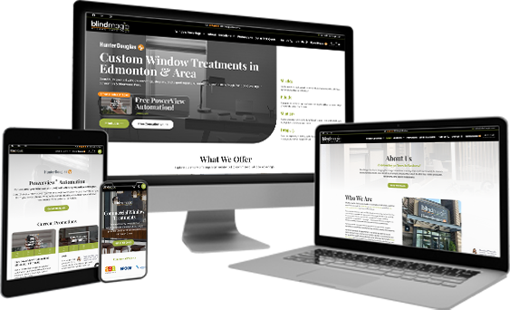
Neo Digital partnered with Blind Magic to overhaul the user journey and visual aesthetic, transforming their website into a seamless, elegant experience that better reflects the precision of their custom work.
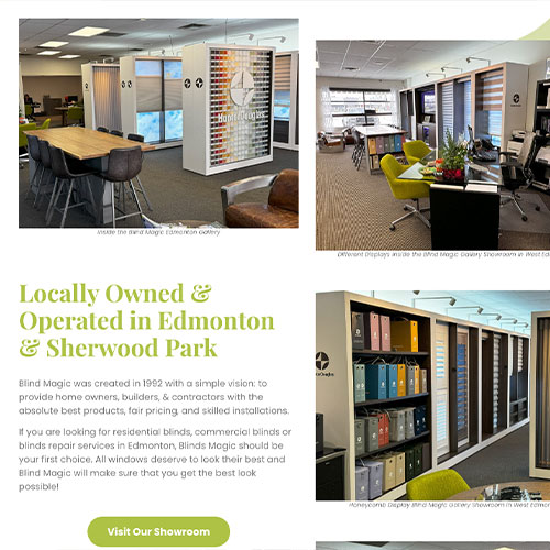
This portfolio highlights the before-and-after of our comprehensive redesign project for Blind Magic. On the left is the previous iteration of the site; on the right is the new, fully modernized experience.
Project Info
Client
Blind Magic
Builder Used
WordPress
Date
June 3, 2026
Location
Edmonton, AB
The Challenge
The older website layout presented several obstacles that Neo Digital sought to correct:
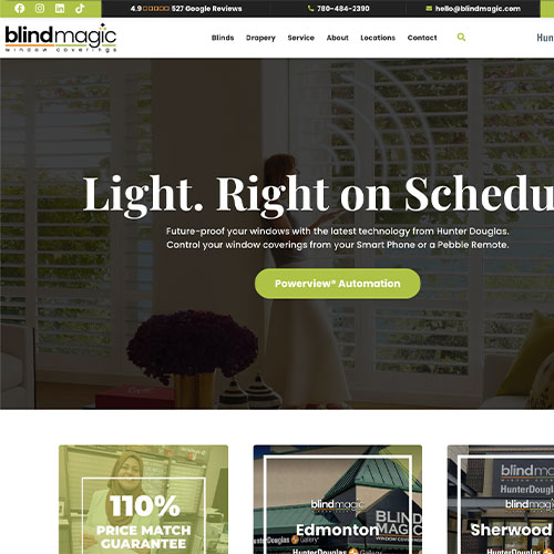
Information Hierarchy: Important navigational elements like product listings were pushed below a large hero image, delaying the user’s path to core services.
Aesthetic Alignment: The dark overlay, bold white serif typography, and lime green accents did not align with the sleek, high-end “custom window treatments” image. The design felt dated.
Conversion Friction: Conversion elements, while present, felt cluttered within the header bar, potentially causing decision fatigue for new leads.
Lower Trust Factors: Features like reviews were less prominently placed and did not immediately build user confidence.
Before Neo Digital
What They Had
Wanted to refresh their site with more of their branding
Wanted to refresh their site with more of their branding
The Results
The new design addresses these issues by delivering a cohesive, modernized user interface:
Immediate Product Awareness: The side-panel navigation list (“Shades,” “Blinds,” “Shutters,” “Drapery”) provides an instant, clear overview of the offering, guiding customers right at the fold.
Sophisticated Aesthetic: The new color palette uses a dark gray instead of pure black, subtle light gray backgrounds, and sophisticated light green and white accents. This is paired with refined serif typography that immediately conveys premium quality.
Simplified Navigation: The upper header navigation is streamlined for clear CTAs (e.g., “Free Consultation,” “Get a FREE Quote”). We successfully cleaned up the top-bar “noise.”
Elevated Brand Trust: Partner logos (HunterDouglas, ALTA) and social proof (613 Google Reviews with a 4.9 rating) are given premium placement in the footer/header to build immediate trust.
Improved Conversion Funnel: CTAs like “Free Consultation” and “Products” are distinctly differentiated. Text-based “Request a Quote” has been moved to a cleaner area in the upper bar, increasing the opportunity for direct leads. The new structure provides an elegant path for users to become paying customers.